
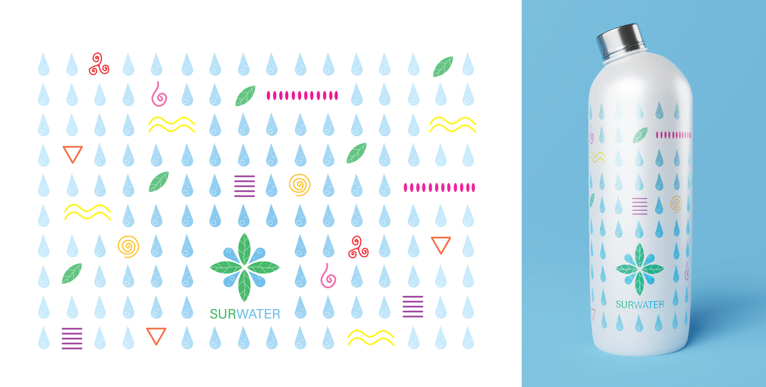
Surwater vision
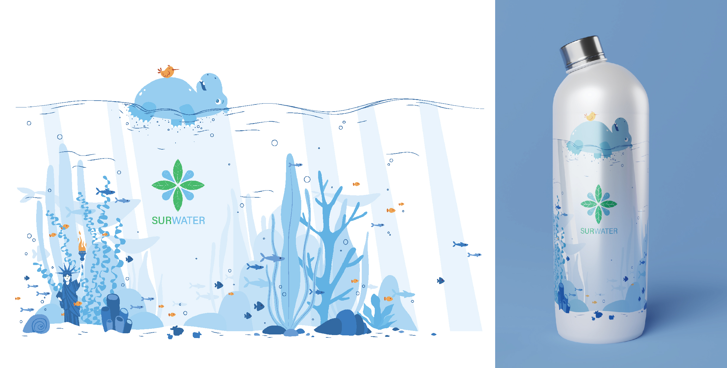
What makes this project especially interesting is that its core idea was inspired by the powerful prefix “SUR”, which became the foundation for the entire brand identity. The logo was born from this concept, capturing the essence of SURWATER. A name that evokes the feeling of floating above water. The bottle design brought a playful twist to this idea, turning the concept into something tangible. From the logo itself, we developed a modern and minimal symbol of water, tying everything back to the original philosophy in a bold and cohesive way.